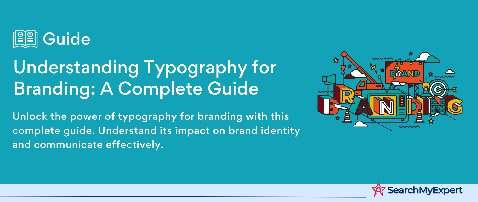
Understanding Typography for Branding: A Complete Guide
Art of Typography
Defining Typography and Its Communicative Power
Typography is an art form that's often overlooked but holds immense power in communication. It's the craft of arranging type to make written language legible, readable, and visually appealing. But, it's more than just choosing fonts – typography involves the careful selection of typeface, point size, line length, line-spacing (leading), and letter-spacing (tracking), as well as the use of color and space.
The Role of Typography in Communication
The role of typography in communication cannot be overstated. It's not just about making words look pretty; it's about conveying a message in the most effective way possible. Good typography enhances the readability of content, ensuring that the message is not only seen but also understood. It's a bridge between the visual and the verbal, a tool that, when used skillfully, can elevate a simple message into a memorable communication.
Typography as the Cornerstone of Brand Identity
A brand's identity is heavily influenced by its use of typography. This aspect of design plays a pivotal role in brand recognition. Think of it as the visual voice of a brand – the way it "speaks" to its audience. The typefaces chosen by a brand can say a lot about its personality, values, and approach. Whether it's professional and authoritative, playful and whimsical, or elegant and sophisticated, typography is a key player in setting the tone.
Key Concepts: Typefaces, Legibility, and Hierarchy
- Typefaces: The choice of typeface is fundamental in typography. From serifs to sans-serifs, each typeface has its own character and feel.
- Legibility: This is about how easy it is to distinguish one letter from another in a particular typeface. Good legibility is crucial for effective communication.
- Hierarchy: This involves using different sizes, weights, and styles of type to create an order of importance within the text, guiding the reader's eye through the content in a logical way.
The Power of Type
Influencing Brand Perception Through Typography
Type is not just letters on a page; it’s a voice. The choice of typeface can deeply influence how a brand is perceived. It’s a subtle yet potent tool in shaping brand image and personality.
Emotion and Typography
The emotional impact of typography is profound. Fonts can evoke feelings of warmth, trust, excitement, or sophistication. A playful, whimsical font sparks joy, while a bold, block typeface can convey strength and reliability. It's these emotional connections that make typography a critical component in branding.
Brand Personality and Values
Typography reflects a brand’s personality. A tech company might opt for a sleek, modern sans-serif to communicate innovation, while a law firm might choose a classic serif to emphasize tradition and trustworthiness. Typography is a visual manifestation of a brand’s values and ethos.
Case Studies: Typography in Action
Apple Inc.
- Typeface: San Francisco
- Brand Personality: Innovation, Simplicity
- Impact: Apple's typography reflects its design philosophy - simple, clean, and user-friendly. It strengthens the brand's image as a leader in tech innovation.
The New York Times
- Typeface: Cheltenham
- Brand Personality: Trustworthiness, Authority
- Impact: The traditional serif font used by The New York Times conveys credibility and authority, crucial for a respected news outlet.
Nike
- Typeface: Futura Bold Condensed
- Brand Personality: Bold, Energetic
- Impact: Nike’s choice of a strong, condensed font resonates with its dynamic and high-energy brand identity.
These examples showcase how effectively used typography can not only complement but amplify a brand’s identity, making it a powerful tool in the arsenal of brand communication.
Choosing the Right Typeface for Your Brand
Understanding Type Classifications
Serif Fonts
- Characteristics: Small lines or strokes attached to the end of a larger stroke in a letter.
- Impression: Traditional, trustworthy, elegant.
- Examples: Times New Roman, Garamond.
Sans-Serif Fonts
- Characteristics: Clean lines without serifs.
- Impression: Modern, clean, approachable.
- Examples: Helvetica, Arial.
Display Fonts
- Characteristics: Decorative, often used for headings or titles.
- Impression: Unique, distinctive, expressive.
- Examples: Cooper Black, Lobster.
Script Fonts
- Characteristics: Resemble handwriting.
- Impression: Elegant, creative, personal.
- Examples: Brush Script, Pacifico.
Factors in Choosing Typefaces for Branding
- Brand Personality: Your font should reflect your brand’s character. A tech startup might prefer a sleek sans-serif, while a luxury brand might opt for an elegant serif.
- Target Audience: Consider who you’re speaking to. Younger audiences might appreciate more modern, dynamic fonts, whereas older demographics might prefer traditional serifs.
- Readability: Especially important for body text. Choose fonts that are easy to read in various sizes and mediums.
- Context: Where will the type be used? Digital platforms have different requirements than print.
Guidelines for Font Pairing
- Contrast is Key: Combine a serif with a sans-serif to create a balanced yet dynamic look.
- Limit the Number of Fonts: Too many fonts can be distracting. Stick to two or three.
- Consistency in Mood: Ensure that the fonts you choose harmonize in style and feel.
- Hierarchy and Functionality: Use different fonts for headings, subheadings, and body text to guide the reader’s eye.
Building a Typographic System for Brand Consistency
What is a Typographic System?
A typographic system is a set of guidelines for using typefaces in a consistent and harmonious way. It's like a blueprint for how text should be used across all brand materials. This system ensures that every piece of communication - from your website to your business cards - feels like part of a cohesive whole.
Benefits:
- Consistency: Creates a unified brand voice.
- Recognition: Enhances brand recall.
- Efficiency: Streamlines the design process.
Elements of a Typographic System
Primary Font
- Your brand's main font, used across most materials.
- Reflects the core identity of the brand.
Secondary Font
- Complements the primary font.
- Used for accents, highlights, or specific content types.
Hierarchy Rules
- Guidelines for using different fonts and styles for headings, subheadings, and body text.
- Ensures clarity and readability.
Spacing and Alignment Principles
- Rules for letter and line spacing, text alignment.
- Crucial for visual harmony and readability.
Developing Your Typographic System
- Assess Your Brand: Understand your brand's personality and values. This will guide your font choices.
- Research and Experiment: Explore different fonts and pairings. Consider legibility, mood, and versatility.
- Set Clear Guidelines: Define rules for font usage, including size, color, and spacing.
- Test Across Mediums: Ensure your system works well in digital and print formats.
- Get Feedback: Iteration is key. Gather input and be willing to adjust.
- Document Your System: Create a reference guide for your team and external partners.
Implementing a typographic system is not a one-time task; it's an ongoing process of refinement and adaptation. But the payoff is a strong, consistent brand identity that resonates with your audience.
Maximizing Typography in Branding
Leveraging Typography Across Brand Elements
Logos
- Function: The face of the brand.
- Example: FedEx. The hidden arrow in the negative space between the 'E' and 'x' demonstrates clever use of type to convey movement and precision.
- Best Practice: Ensure the type is distinct and scalable.
Websites
- Function: Digital storefront.
- Example: Airbnb. Their approachable sans-serif font enhances user experience and readability.
- Best Practice: Prioritize legibility and web compatibility.
Packaging
- Function: Physical brand touchpoint.
- Example: Coca-Cola. The iconic script maintains brand heritage and recognition.
- Best Practice: Align with brand personality and ensure readability under different sizes and conditions.
Marketing Materials
- Function: Communication tools.
- Example: Nike. The bold, condensed typeface in their campaigns mirrors their energetic brand persona.
- Best Practice: Maintain consistency across all materials.
Enhancing Brand Experience with Typography
- Consistency: Use a coherent typographic style across all platforms.
- Emotional Connection: Choose fonts that evoke the desired brand emotions.
- Accessibility: Ensure fonts are readable for a diverse audience.
- Innovation: Don’t be afraid to experiment, but stay true to your brand identity.
Typography in branding isn't just about looking good; it's about creating a connection, telling a story, and building a memorable brand experience.
Navigating Typographic Pitfalls in Branding
Common Typographic Mistakes
Inappropriate Typeface Choice
- Impact: Misalignment with brand identity.
- Example: Using a playful, whimsical font for a law firm.
- Tip: Align typeface with brand tone and values.
Poor Legibility
- Impact: Confuses and frustrates the audience.
- Example: Overly decorative fonts in body text.
- Tip: Prioritize readability, especially in long texts.
Inconsistent Application
- Impact: Dilutes brand recognition and trust.
- Example: Varying fonts across different platforms.
- Tip: Establish a typographic system and adhere to it.
Overuse of Styles and Effects
- Impact: Clutters and cheapens brand appearance.
- Example: Excessive use of bold, italics, or underlining.
- Tip: Use styles sparingly to maintain elegance and clarity.
Mitigating Negative Impacts
- Conduct Research: Understand your brand and audience before choosing fonts.
- Seek Feedback: Regularly review and get feedback on typographic choices.
- Stay Updated: Be aware of current trends and best practices in typography.
- Professional Assistance: Consider consulting with a design professional.
By avoiding these common mistakes and embracing best practices, brands can ensure their typography reinforces rather than undermines their identity.
Navigating the Future of Typography in Branding
The Evolving Landscape of Typography
The world of typography is not static; it evolves constantly, mirroring changes in technology, culture, and consumer behavior. Today, we stand at the cusp of a new era in typography, driven by digital innovation and creative exploration.
Emerging Trends
Variable Fonts
- What They Are: Fonts that allow customization of style, weight, width, and more within a single file.
- Implications: Greater flexibility and responsiveness in digital environments. Brands can adjust typography seamlessly for different devices and contexts.
Interactive Typography
- What It Is: Type that interacts with users, often in digital settings.
- Implications: Enhances user engagement. Brands can use interactive type to create memorable experiences and communicate dynamically with their audience.
Integration with New Technologies
- Examples: Augmented reality (AR), virtual reality (VR), and AI.
- Implications: Opens new avenues for brand storytelling and immersive experiences. Typography in AR and VR can create a deeper level of interaction and engagement.
Adapting to the Future
Stay Informed
- Keep abreast of technological advancements and typographic innovations.
- Understand how changes in digital platforms and user behaviors might influence typographic choices.
Be Experimental
- Embrace new technologies like variable and interactive fonts.
- Experiment with typography in different mediums, including digital and experiential marketing.
Focus on User Experience
- Ensure that new typographic trends align with user needs and preferences.
- Balance innovation with readability and accessibility.
Maintain Brand Consistency
- While exploring new trends, keep the core identity of the brand intact.
- Use innovative typography to enhance, not overshadow, brand messaging.
Future-Proofing Brand Identity
Integrating Typography with Brand Strategy
- Consider typography as an integral part of the overall brand strategy, not just a design element.
- Anticipate and adapt to changes in the way people interact with brands.
Leveraging Data and AI
- Utilize data analytics and AI to understand how audiences respond to different typographic styles and applications.
- Personalize typographic experiences based on user data.
Sustainability and Responsibility
- With the rise of social consciousness, consider the environmental impact of typography choices, particularly in print.
- Embrace ethical practices in design and messaging.
The future of typography in branding is exciting and full of potential. Brands that are willing to innovate, while staying true to their core identity, are poised to thrive in this dynamic landscape.
Conclusion
Typography is far more than just a choice of font; it's a pivotal element in branding that resonates with audiences on a profound level. This journey through the world of typography has illuminated its critical role in shaping brand identity, communication, and experience.
We started by understanding the basics of typography and its impact on brand perception. Then, we delved into the strategic choice and pairing of typefaces, and the creation of a cohesive typographic system. The exploration extended into practical applications across various brand elements and highlighted common pitfalls to avoid.
In conclusion, typography in branding is not just about aesthetics; it's a strategic tool that, when used effectively, can elevate a brand from merely being seen to being understood and remembered. As the landscape of typography evolves, the brands that embrace its power and potential will be the ones that stand out and connect deeply with their audiences.
Create impactful designs with the expertise of our Graphic Design Firms.
share this page if you liked it 😊
Other Related Blogs


Mastering Docker for App Development: A Comprehensive Guide to Benefits, Use-Cases, and Alternatives

STAY UP TO DATE
GET PATH'S LATEST
Receive bi-weekly updates from the SME, and get a heads up on upcoming events.
Contact Us