Hey there, awesome visitor! 👋 Our website is currently undergoing some nifty upgrades to serve you even better. But don't worry, we'll be back before you can say "SearchMyExpert rocks!"
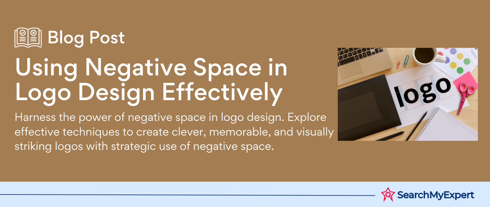
Using Negative Space in Logo Design Effectively
Understanding Negative Space in Logo Design
Defining Negative Space in Logo Design
Negative space, often overlooked, plays a pivotal role in logo design. It's the background space around and between the subject of an image. Unlike the main focus, negative space defines and balances the positive space, creating a visually appealing and memorable logo.
Differentiating Between Negative and Positive Space
- Positive Space: The main focus; it's the actual subject, such as a symbol or letter.
- Negative Space: The background space; it's the area surrounding the subject.
The interplay between these spaces is crucial in logo design. While positive space is the main draw, negative space is the silent hero, shaping the story and setting the tone.
The Role of Negative Space in Composition
- Balance and Harmony: It creates a visual balance, ensuring the logo isn't overwhelming.
- Hidden Meanings: Clever use of negative space can embed secondary images or meanings.
- Simplicity and Clarity: A well-designed negative space makes a logo easy to understand and memorable.
- Versatility: Logos with well-executed negative space are more adaptable across various mediums.
Iconic Logos Utilizing Negative Space
- FedEx: The arrow hidden between the 'E' and 'x' signifies speed and precision.
- Toblerone: A bear silhouette within the mountain reflects the brand's origin in Bern, Switzerland, known as the city of bears.
- NBC: The peacock in negative space represents pride and broadcasting excellence.
Negative space in logo design is more than just a background; it's an artistic element that brings balance, meaning, and sophistication to a brand's visual identity.
Power of Simplicity in Logo Design Through Negative Space
Simplifying Complex Designs with Negative Space
Negative space is a masterful tool in transforming complex designs into elegant simplicity. It strips away the unnecessary, focusing on the essential elements. This approach yields designs that are not only aesthetically pleasing but also easy to comprehend and remember.
Techniques for Simplification:
- Reduction: Minimizing details to leave only the core elements.
- Contrast: Using stark contrasts to highlight the main subject.
- Spatial Relationships: Positioning elements to create meaningful shapes in the negative space.
Contribution to Memorability and Visual Clarity
Negative space creates logos that are easy on the eyes and mind. This clarity and simplicity make them more memorable. Key benefits include:
- Instant Recognition: Simple logos are more easily recognized and recalled.
- Timelessness: Minimalist designs resist trends and age gracefully.
- Adaptability: Simplified logos scale better across different mediums.
Examples of Logos Leveraging Negative Space for Minimalism
- The Guild of Food Writers: Features a pen nib that also looks like a spoon, symbolizing writing about food.
- Yoga Australia: The negative space in the arm and leg forms the map of Australia.
- Spartan Golf Club: A golfer's swing also forms the profile of a Spartan helmet.
These examples showcase how negative space can turn a logo into a minimalist yet powerful symbol, making it memorable and versatile.
Meaningful Messaging Through Negative Space in Logo Design
Reinforcing Brand Identity with Negative Space
Negative space isn't just a design element; it's a storytelling tool that can reinforce a brand's identity. It enables logos to encapsulate a brand's essence, values, and personality. This strategic use of space helps create a deeper connection with the audience.
Strengthening Brand Identity:
- Reflecting Core Values: Negative space can symbolize a brand's principles.
- Brand Personality: It can infuse a logo with character, making the brand more relatable.
- Creating a Unique Image: Innovative use of negative space sets a brand apart.
Conveying Dual Meanings or Hidden Messages
Negative space masterfully hides symbols or messages, adding layers of meaning to a logo. This duality not only captures attention but also engages the viewer on a deeper level, making the brand more memorable.
Dual Meanings through Negative Space:
- Subtle Symbolism: Incorporating symbols that resonate with the brand story.
- Hidden Elements: Embedding secondary images or messages that reveal more about the brand.
Showcasing Logos with Stories and Emotions
- Beats by Dre: The negative space forms a person's profile, suggesting someone wearing headphones, aligning with the brand's focus on personal audio.
- World Wildlife Fund (WWF): The famous panda logo uses negative space to highlight the animal's key features, emphasizing the brand's commitment to wildlife conservation.
- Amazon: The arrow from A to Z in the logo not only suggests a smile but also represents the brand's wide range of offerings.
These logos utilize negative space to tell a story or evoke emotions, deepening the audience's connection with the brand.
Creative Playfulness with Negative Space in Logo Design
Encouraging Experimentation in Design
Incorporating negative space in logo design opens doors to creativity and innovation. Designers are encouraged to experiment with shapes, lines, and optical illusions, offering a playground for imagination.
Techniques for Creative Experimentation:
- Shapes and Lines: Using geometric or abstract shapes to create visual interest.
- Optical Illusions: Crafting designs that challenge perception and engage viewers.
- Dynamic Compositions: Creating logos that change or reveal new elements on different views.
Visual Puns and Unexpected Interpretations
Negative space is ideal for visual puns and unexpected interpretations, adding an element of surprise and delight. This approach makes logos not only visually appealing but also conversation starters.
Incorporating Humor and Wit:
- Clever Imagery: Combining elements to create a humorous or witty visual pun.
- Dual Interpretations: Designing logos that can be interpreted in more than one way.
Examples of Logos Using Negative Space for Amusement
- The Wine Place: The negative space forms wine glasses between bottle shapes.
- Elefont: The space in the letter 'E' forms an elephant's trunk, cleverly linking the name and imagery.
- Baskin Robbins: The pink sections of the 'BR' form the number '31', representing the brand's famous 31 flavors.
These examples show how negative space can be used to create engaging and amusing logos, enhancing brand appeal and audience engagement.
Striking the Balance: Negative Space in Logo Design
The Importance of Finding the Right Amount of Negative Space
Achieving the right balance of negative space in logo design is crucial. It's a delicate dance between too much and too little, each impacting the logo's effectiveness and appeal.
Why Balance Matters:
- Visual Appeal: Proper balance makes a logo aesthetically pleasing.
- Clarity and Readability: Too much or too little space can hinder message delivery.
- Brand Perception: Balanced logos reflect a professional and thoughtful brand image.
Dangers of Overusing or Underusing Negative Space
- Overuse: Can make a logo feel sparse, losing its impact and meaning.
- Underuse: Leads to a cluttered, confusing, and unmemorable logo.
Balance is key to ensuring the logo communicates effectively without overwhelming or underwhelming the viewer.
Examples of Logos with Good Balance
- Apple: The bite in the apple creates just enough negative space to be distinctive without overcomplicating the design.
- Nike: The swoosh is a simple yet powerful use of negative space, creating a sense of movement and precision.
- NBC: The peacock logo uses negative space to form the bird's feathers in a balanced and visually appealing way.
These logos demonstrate how the right amount of negative space can make a design stand out while maintaining visual harmony and clarity.
Technical Considerations in Using Negative Space in Logo Design
Factors Influencing the Use of Negative Space
When leveraging negative space in logos, several technical factors must be considered to ensure the design is effective and versatile.
Key Factors to Consider:
- Color Contrast: High contrast between negative and positive space enhances visibility and impact.
- Legibility: The design should be easily readable at various sizes.
- Scalability: Logos must retain their integrity when scaled up or down.
Design Principles for Cross-Platform Effectiveness
- Simplicity: The more straightforward the design, the better it translates across different platforms.
- Flexibility: Logos should adapt to different backgrounds and contexts without losing clarity.
- Consistency: Maintaining a consistent design language ensures recognizability across mediums.
Examples of Logos Overcoming Technical Challenges
- Carrefour: The negative space creates a 'C' in a two-tone logo, maintaining clarity even when the color scheme changes.
- LG: The logo retains its distinct face-like image in negative space, whether scaled up for billboards or down for mobile screens.
- Formula 1: The negative space '1' remains prominent and legible across various applications, from merchandise to digital platforms.
These logos demonstrate how thoughtful consideration of technical aspects in using negative space can lead to versatile, scalable, and impactful designs.
Putting it into Practice: Negative Space in Logo Design
Practical Tips for Incorporating Negative Space
Incorporating negative space in logo design requires a blend of creativity and technical know-how. Here are some practical tips to guide designers:
Tips for Effective Use of Negative Space:
- Start with the Basics: Begin with simple shapes and forms.
- Think in Layers: Consider both the foreground and background as active design elements.
- Play with Perception: Experiment with ways to embed symbols or messages.
- Focus on Balance: Ensure that negative and positive spaces complement each other.
Brainstorming Techniques and Sketching Methods
- Mind Mapping: Start with the brand’s core idea and branch out with related concepts.
- Thumbnail Sketches: Create small, quick sketches to explore different ideas.
- Reverse Thinking: Imagine the negative space first and build the positive space around it.
- Iterative Sketching: Refine ideas through multiple sketch iterations.
Inspiring Examples of Successful Negative Space Logos
- NBC: The peacock logo cleverly uses negative space to form the bird's feathers, symbolizing the network’s broad range of programming.
- FedEx: The hidden arrow between the ‘E’ and ‘x’ in the FedEx logo symbolizes speed and precision.
- Toblerone: The bear hidden in the mountain reflects the brand's origin and adds a layer of intrigue.
These examples illustrate the power of negative space in creating memorable and impactful logos.
Conclusion
In the realm of logo design, the effective use of negative space is not just a technique; it's an art form. This article has journeyed through the various facets of negative space, from its role in simplifying complex designs to its ability to convey dual meanings and evoke emotions. We've seen how balancing this subtle yet powerful element can make or break a design, and how technical considerations like color contrast, legibility, and scalability are crucial.
By examining iconic examples and offering practical tips, we've illuminated the path for designers to leverage negative space creatively and effectively. Whether it's through playful imagery or a sophisticated blend of shapes and lines, the potential of negative space in logo design is boundless.
As you embark on your next design project, remember the lessons and examples shared here. Let them inspire you to experiment, innovate, and create logos that not only capture the essence of a brand but also leave a lasting impression. Negative space, when used masterfully, can transform a simple logo into an enduring symbol of a brand's identity.
Unleash your brand's character with Logo Designing Services.
share this page if you liked it 😊
Other Related Blogs


Mastering Docker for App Development: A Comprehensive Guide to Benefits, Use-Cases, and Alternatives

STAY UP TO DATE
GET PATH'S LATEST
Receive bi-weekly updates from the SME, and get a heads up on upcoming events.
Contact Us


Copyright © 2023 · Skillpod Private Limited · All Rights Reserved - Terms of Use - Privacy Policy