Create a Brand Identity using Shape Psychology in Logo Design
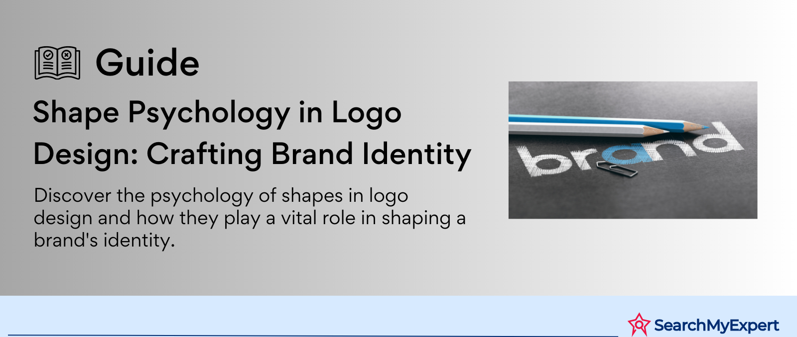
The Psychology of Shape in Logo Design
Logos hold a paramount place in the realm of branding and communication. They are not just mere symbols; logos are the visual embodiment of a brand's identity, conveying its core values, ethos, and personality. In the competitive landscape of business, a well-designed logo acts as a critical tool for creating a memorable and positive impression on consumers. It aids in differentiating a brand from its competitors and fosters brand loyalty.
The influence of shapes on human perception and psychology.
One of the most intriguing aspects of logo design is the use of shapes, which play a significant role in human perception and psychology. Shapes in logos are more than just aesthetic elements; they carry deep-seated psychological meanings that can subconsciously influence how a viewer perceives and interacts with a brand. For example, circles often evoke feelings of unity, wholeness, and harmony, whereas angular shapes like squares and triangles can convey stability, balance, and dynamism.
This article aims to explore the profound impact of different shapes in logo design and how they contribute to brand messaging. By examining various shapes and their psychological implications, the article seeks to provide insights into how these shapes can be strategically used in logo design to effectively communicate a brand's message and connect with the target audience on a deeper level. This exploration is not just about the visual appeal of logos but about understanding the subtle yet powerful ways in which shapes can influence consumer perception and brand identity.
Understanding Basic Shapes and Their Meanings
In logo design, basic shapes like circles, squares, and triangles are more than just geometric figures; they carry inherent psychological associations that can evoke specific emotions and convey distinct traits. Understanding these associations helps in creating logos that effectively communicate a brand's identity and values.
- Circles: Often associated with unity, wholeness, and harmony, circular shapes in logos can convey a sense of community, friendship, and inclusivity. They are also linked to femininity and protection. For instance, the Olympic rings symbolize the unity of the five continents and the coming together of athletes from around the world in a spirit of sportsmanship and harmony.
- Squares and Rectangles: These shapes suggest stability, trustworthiness, and professionalism. They are often used by companies wanting to project strength and reliability. The square shape of the LinkedIn logo, for instance, evokes a sense of security and professionalism, resonating with its role as a professional networking platform.
- Triangles: Triangles are dynamic shapes that can convey progress, direction, and purpose. They are also associated with power, science, and religion. The upward-pointing triangle in the Adidas logo, for example, symbolizes a mountain, representing the challenges and achievements in sports.
- Horizontal Lines: Horizontal lines in logos can suggest calmness, tranquility, and stability. They are often used in logos to give a sense of peace and professionalism.
- Vertical Lines: These lines are associated with strength, courage, and aggression. They can convey a sense of boldness and power.
- Spirals: Spirals can denote creativity, growth, and evolution. They are often used to suggest a sense of progress and innovation.
The Power of Negative Space and Shape Integration in Logo Design
In the world of logo design, the strategic use of negative space and the integration of shapes can elevate a logo from being merely a symbol to a storytelling device. This sophisticated approach to design not only enhances the visual appeal of a logo but also embeds deeper meanings and symbolism, enriching the brand's narrative.
Understanding Negative Space in Logos
Negative space, often overlooked, is the area around and between the elements of a design. This "empty" space is a powerful tool in the hands of a skilled designer, capable of transforming a simple logo into a multi-layered visual story.
- Creating Dual Imagery: One of the most creative uses of negative space is to create dual imagery. This involves designing a logo in such a way that the negative space forms an additional, relevant image. A classic example is the FedEx logo, where the space between the 'E' and 'x' forms an arrow, subtly suggesting speed and precision.
- Enhancing Brand Messaging: Negative space can also be used to reinforce a brand's message or values. For instance, the WWF (World Wildlife Fund) logo uses negative space to depict a panda, which not only makes the logo memorable but also reinforces their commitment to wildlife conservation.
Integrating Shapes for Symbolism and Complexity
The combination of different shapes in a logo can add layers of meaning and complexity, making the logo more symbolic and intriguing.
- Conveying Multiple Concepts: By overlapping or blending shapes, a logo can convey multiple aspects of a brand's identity. The Olympic rings, for example, are interlocking circles that represent the five continents, symbolizing unity and the global nature of the event.
- Creating Visual Harmony: Integrating shapes can also create a sense of balance and harmony in the logo. The Toyota logo, with its overlapping ovals, represents the unification of the hearts of the customers and the heart of the company, creating a sense of trust and mutual respect.
Showcasing Effective Use of Negative Space and Shape Integration
Several logos stand out as benchmarks in the effective use of negative space and shape integration.
- NBC Logo: The NBC logo features a peacock with its feathers represented by colorful shapes. The use of negative space between these shapes creates the peacock's body and beak, symbolizing the broadcasting company’s pride in its colorful programming.
- Toblerone Logo: The Swiss chocolate company's logo features a mountain, representing the Matterhorn. A closer look reveals a bear hidden within the negative space, a nod to the city of Bern, where Toblerone originated, which is also known as the city of bears.
- Amazon Logo: Amazon’s logo seems simple at first glance, with an arrow pointing from A to Z. This not only suggests that the company sells everything from A to Z but also forms a smile, representing customer satisfaction.
- Baskin Robbins Logo: The Baskin Robbins logo cleverly uses the negative space within the BR to depict the number 31, highlighting the variety of flavors they offer.
- Gillette Logo: The Gillette logo uses negative space to create a precise cut between the 'G' and the 'i', subtly suggesting the precision of its razors.
- The Pittsburgh Zoo & PPG Aquarium Logo: This logo uses negative space brilliantly to depict a gorilla and a lion facing each other on either side of a tree. The tree, made out of fish, also represents the aquarium part of the zoo.
Cultural and Contextual Considerations in Logo Design
In the multifaceted world of logo design, understanding cultural and contextual nuances is essential. Shapes, while universally recognizable, can have varying meanings across different cultures and industries. This diversity in interpretation necessitates a high degree of cultural sensitivity, especially when designing logos for a global audience.
The Cultural Variance of Shape Meanings
The perception of shapes is not monolithic; it can shift dramatically across different cultural landscapes.
- Circles: In many Western cultures, circles often symbolize unity and harmony. However, in some Asian cultures, the circle can represent perfection and the divine. The ensō circle in Zen Buddhism, for instance, symbolizes enlightenment and the universe.
- Squares and Rectangles: These shapes usually denote stability and trust in the West. In contrast, in some Eastern cultures, squares are associated with the Earth and materiality, representing groundedness and practicality.
- Triangles: In Western contexts, triangles pointing upwards suggest growth and progress, while downward-pointing triangles are often associated with instability. In contrast, Hindu and Buddhist traditions in Asia use triangles pointing downward as symbols of divine feminine energy.
- Color and Shape Combinations: The meaning of shapes can also be influenced by their color. For example, a red square might be perceived differently in cultures where red symbolizes luck and prosperity (like in China) compared to cultures where red might represent danger or warning.
Contextual Importance in Different Industries
Shapes can also take on specific connotations based on the industry context.
- Technology Sector: Sleek lines and angular designs, often found in triangles or polygons, are commonly used to convey innovation and cutting-edge technology.
- Healthcare Industry: Softer shapes like circles and ovals, suggesting care and community, are prevalent in healthcare and wellness brand logos.
- Legal and Financial Services: Squares and rectangles, denoting stability and professionalism, are favored in these sectors.
Emphasizing Cultural Sensitivity in Global Logo Design
Designing logos for a global audience requires a deep understanding of cultural sensitivities. A shape that is positively perceived in one culture might have negative connotations in another. For instance:
- Geometric Patterns in Islamic Art: Geometric shapes are widely used in Islamic art and architecture, symbolizing the infinite nature of Allah. A logo design incorporating such patterns for a business in an Islamic country should be done with a deep understanding of these meanings.
- Animal Shapes: The depiction of certain animals in logos can be culturally sensitive. For instance, a logo with a cow might be well-received in India due to the animal's sacred status but could have different connotations in Western countries.
- Localizing Global Brands: International brands often adapt their logos for different markets. McDonald’s, for example, changes its logo colors in different countries to align better with local cultures—like turning their iconic red background to green in some European countries to align with local values of sustainability.
Shape and Color: A Powerful Partnership in Logo Design
The synergy between shape and color in logo design is a fundamental aspect of creating a compelling brand identity. While shapes are powerful in conveying a brand's message, the addition of color can significantly amplify this communication. This combination of shape and color plays a critical role in how a logo is perceived and can greatly influence consumer emotions and behaviors.
The Interplay of Shape and Color in Logos
The strategic use of color in combination with shapes can enhance or alter the psychological impact of a logo.
- Harmony and Contrast: The right color can complement a shape, enhancing its inherent message, or it can create contrast, adding a layer of complexity. For example, a circular logo, which typically conveys unity and harmony, can be made more energetic and exciting with the use of bright, bold colors like red or orange.
- Cultural and Emotional Associations: Colors carry cultural and emotional associations that can vary significantly across different societies. For instance, while white is often associated with purity and simplicity in many Western cultures, it is associated with mourning in some Eastern cultures. This cultural perspective on color, when combined with shapes, can significantly influence the logo’s reception in different markets.
- Industry-Specific Color Schemes: Certain industries tend to favor specific color palettes that align with their brand messaging. Tech companies, for example, often use blues and blacks for their logos to convey professionalism and innovation. In contrast, food and beverage companies tend to use reds and yellows to stimulate appetite and convey energy.
Enhancing Logo Psychology Through Color and Shape
The combination of shape and color in a logo can communicate a brand’s personality more effectively.
- Stability and Trust: A square or rectangular logo in blue can enhance feelings of stability and trust. The IBM logo is a classic example, with its blue-striped square design conveying reliability and professionalism.
- Energy and Excitement: Triangular logos are dynamic, and when combined with warm colors like red or yellow, they can convey a sense of energy and excitement. The Citgo logo, with its red, white, and blue triangle, is an example that conveys dynamism and vibrancy.
- Growth and Vitality: Circular logos suggest continuity and unity, and when paired with green, they can also convey growth and natural vitality. The Starbucks logo, with its green and white circular design, invokes a sense of environmental consciousness and ethical sourcing.
Case Studies of Effective Shape and Color Combinations
Several well-known logos masterfully combine shape and color to create a unified brand identity.
- Apple Logo: The Apple logo is a great example of shape and color working together. The bitten apple shape is iconic and memorable, and its use of silver or black colors conveys simplicity, elegance, and modernity.
- McDonald’s Logo: The golden arches of McDonald's, in the shape of an 'M', are instantly recognizable. The use of the color gold on a red background creates a sense of warmth and appetite stimulation, aligning perfectly with the fast-food industry.
- BP Logo: The BP logo uses a green and yellow sunflower design. The helix shapes within the flower, combined with the green color, suggest energy and environmental friendliness, which is particularly poignant for an energy company.
- Google Logo: Google’s logo uses primary colors for its letters, with a single letter in a secondary color. This combination of simple shapes (letters) and bold colors creates a logo that is playful yet professional, aligning with Google's image as an innovative and approachable tech company.
- Nike Logo: The Nike “Swoosh” is a simple, fluid shape that conveys motion and speed. Its usual black color adds a level of sophistication and versatility, making the logo effective across various mediums.
Case Studies: Deconstructing Successful Logos Through Shape Psychology
The power of a well-designed logo lies in its ability to communicate a brand’s essence through a simple visual form. Analyzing successful logos through the lens of shape psychology reveals how strategic choices in shape contribute to a brand's personality, values, and connection with its target audience. This examination encourages a deeper understanding of the effectiveness of shape choices in logo design.
Apple Logo: The Power of the Bite
The Apple logo, featuring an apple with a bite taken out, is a triumph of simplicity and symbolism.
- Shape Psychology: The apple shape is universally recognized and carries connotations of knowledge, discovery, and innovation, stemming from the biblical story of Adam and Eve and the apple of knowledge. The bite mark adds uniqueness, making it distinguishable from a simple fruit depiction, and subtly plays on the word 'byte', a nod to technology.
- Brand Personality and Values: This logo encapsulates Apple's core values of innovation, simplicity, and elegance. The clean lines and the absence of additional elements reflect Apple's design philosophy of minimalism and functionality.
- Effectiveness: The uniqueness of the bitten apple creates a memorable and distinctive logo, setting Apple apart in the technology industry. It resonates with a wide audience, from tech enthusiasts to everyday consumers, aligning perfectly with the brand's aim to create user-friendly yet sophisticated technology.
Nike's Swoosh: Symbolizing Motion and Ambition
Nike’s “Swoosh” is a simple, fluid shape that has become synonymous with the brand's identity.
- Shape Psychology: The Swoosh resembles a checkmark, a universal symbol of correctness and approval, and also mimics a wing, drawing inspiration from the Greek goddess of victory, Nike. It conveys motion, speed, and dynamism, reflecting the essence of sports and athleticism.
- Brand Personality and Values: The Swoosh encapsulates Nike's spirit of determination, excellence, and the drive to push limits. It represents the brand's commitment to inspiring and innovating for every athlete in the world.
- Effectiveness: The Swoosh is effective in its universality and simplicity. It's easily recognizable, adaptable across various media, and resonates with athletes and fitness enthusiasts globally, embodying the brand’s “Just Do It” attitude.
Mercedes-Benz Star: Elegance and Excellence
The Mercedes-Benz logo, a three-pointed star enclosed in a circle, is a symbol of luxury and quality in the automotive industry.
- Shape Psychology: The star symbolizes dominance in land, sea, and air, reflecting the brand's ambition and engineering excellence. Enclosed in a circle, it also conveys unity and perfection.
- Brand Personality and Values: The logo represents sophistication, technological innovation, and timeless elegance. It aligns with Mercedes-Benz's positioning as a provider of high-quality, luxury vehicles.
- Effectiveness: The logo’s simplicity and symmetry make it highly recognizable and aspirational. It appeals to a demographic that values luxury and status, effectively communicating the brand’s promise of unparalleled quality and craftsmanship.
McDonald’s Golden Arches: The Icon of Fast Food
McDonald’s logo, known as the “Golden Arches,” is one of the most recognizable symbols globally.
- Shape Psychology: The arches, forming an 'M', convey a sense of welcome and reliability. Their rounded shape evokes a feeling of comfort and familiarity, akin to a home.
- Brand Personality and Values: The logo encapsulates the brand’s values of consistency, speed, and affordability. It also reflects McDonald’s goal of being a friendly and accessible food service provider.
- Effectiveness: The Golden Arches are instantly identifiable, transcending language barriers. They are comforting and familiar to customers worldwide, embodying the universal appeal of McDonald’s.
Coca-Cola's Cursive Script: Classic and Timeless
Coca-Cola’s logo, with its distinctive cursive script, is a classic example of timeless logo design.
- Shape Psychology: The flowing script and the dynamic ribbon-like shapes of the letters convey a sense of tradition, happiness, and nostalgia. The roundness of the letters adds a friendly and approachable feel.
- Brand Personality and Values: The logo reflects Coca-Cola's heritage and its position as a purveyor of happiness and good times. It captures the brand's classic, timeless charm, while also being dynamic and forward-looking.
- Effectiveness: The logo’s script is unique, making it instantly recognizable and emotionally resonant. It appeals to a wide range of consumers, symbolizing more than just a beverage but a shared experience.
Shapes as Strategic Tools for Effective Logos
The exploration of shapes in logo design reveals their profound psychological impact and their strategic importance in creating effective brand identities. This comprehensive journey through the various aspects of shape psychology in logos underscores the need for intentional and thoughtful design in branding. Here, we recap the key takeaways and provide final thoughts for both designers and brand strategists.
Recap of Key Takeaways
- Inherent Meanings of Shapes: We've seen how basic shapes like circles, squares, and triangles carry inherent psychological meanings. Circles often symbolize unity and harmony, squares imply stability and trustworthiness, and triangles suggest dynamism and progression. Understanding these inherent meanings is crucial for conveying the right message through a logo.
- The Role of Negative Space: The use of negative space in logos can create additional layers of meaning, making a logo not just a symbol but a narrative in itself. Well-known examples like the FedEx and Toblerone logos illustrate how negative space can add depth and memorability.
- Cultural and Contextual Sensitivity: The meanings of shapes can vary significantly across cultures and industries. A shape that is positively perceived in one culture might have negative connotations in another. This cultural sensitivity is paramount in global brand strategies.
- Shape and Color Synergy: The combination of shape and color can amplify the psychological impact of a logo. This synergy is a powerful tool in conveying a brand’s personality and values more effectively.
- Case Studies of Successful Logos: Analyzing successful logos, such as those of Apple, Nike, and McDonald’s, showcases how these brands have effectively used shapes to convey their core values and connect with their audience.
Importance of Intentional Shape Selection
The strategic selection of shapes in logo design cannot be overstated. It's not just about aesthetic appeal; it's about embedding a brand's identity and message into a simple yet powerful visual form. A well-chosen shape can:
- Evoke the Desired Emotional Response: Depending on the shape used, a logo can evoke feelings of trust, excitement, sophistication, or innovation among the target audience.
- Enhance Brand Recall: Memorable logos often have a unique combination of shapes and colors, making them easily recognizable and recallable.
- Align with Brand Personality: The shape should align with the brand’s personality, whether it’s a tech company that wants to convey innovation (with angular shapes) or a health brand aiming to communicate care and comfort (with rounded shapes).
Final Thoughts and Encouragement for Designers
As we conclude this exploration, it's clear that the psychological impact of shapes in logo design is both profound and nuanced. Designers and brand strategists should approach logo creation not just as a design challenge but as a strategic branding endeavor. Here are some final thoughts:
- Embrace the Power of Simplicity: Often, the most powerful logos are simple in design but deep in meaning. A simple shape, used effectively, can tell a story more powerfully than a complex, overly detailed logo.
- Stay Informed and Empathetic: Understanding cultural nuances and staying updated with changing perceptions is key in designing logos that resonate with a diverse audience.
- Experiment and Innovate: While traditional meanings of shapes are important, there’s always room for creativity and innovation. Designers should feel empowered to experiment with shapes in new and unconventional ways.
Conclusion:
The art of logo design extends far beyond aesthetic appeal, delving into the realm of psychological influence and strategic communication. This guide has illuminated the pivotal role of shapes in conveying a brand's identity, values, and message. By understanding the inherent meanings of various shapes, the significance of color and shape synergy, and the necessity for cultural sensitivity, designers and brand strategists can create logos that not only captivate the eye but also engage the mind. As we conclude, we encourage designers to harness the power of shape psychology, blending creativity with strategic thinking, to craft logos that are not only visually stunning but also deeply resonant with their target audiences. This approach to logo design promises to forge stronger connections between brands and their consumers, elevating branding to a form of meaningful storytelling.
Redefine your corporate identity with Logo Design Firms.
share this page if you liked it 😊
Other Related Blogs


Mastering Docker for App Development: A Comprehensive Guide to Benefits, Use-Cases, and Alternatives

STAY UP TO DATE
GET PATH'S LATEST
Receive bi-weekly updates from the SME, and get a heads up on upcoming events.
Contact Us